


What is a Police Protection Direction and how have the relevant DV laws changed from January 2026?
It is important to know your rights and any potential penalty should you choose not to cooperate with the police.
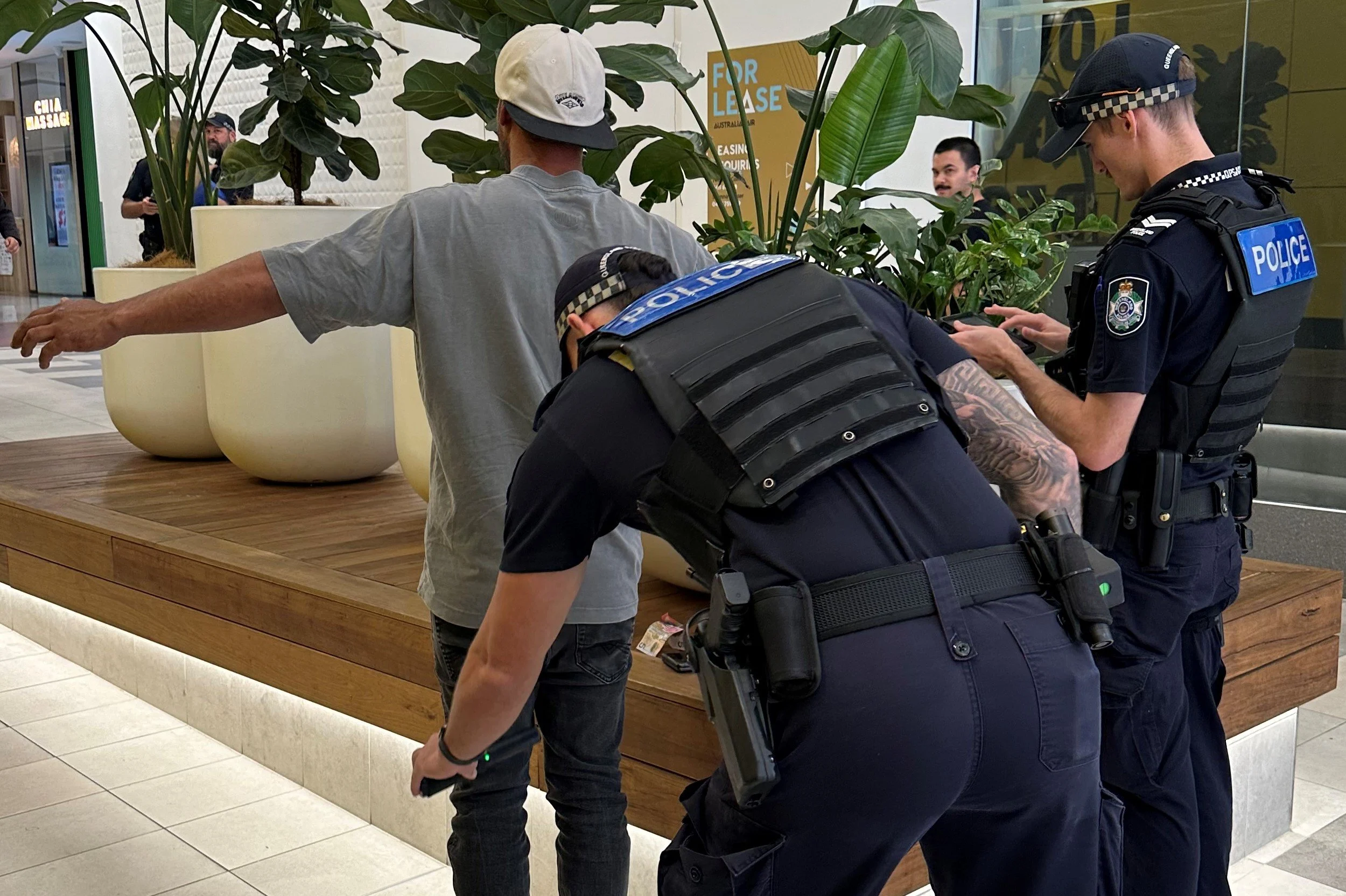
When and how can the Police search me, my property or vehicle in Queensland?
Know Your Rights: Police Search Powers in Queensland In Queensland, police officers are granted significant powers to conduct searches of
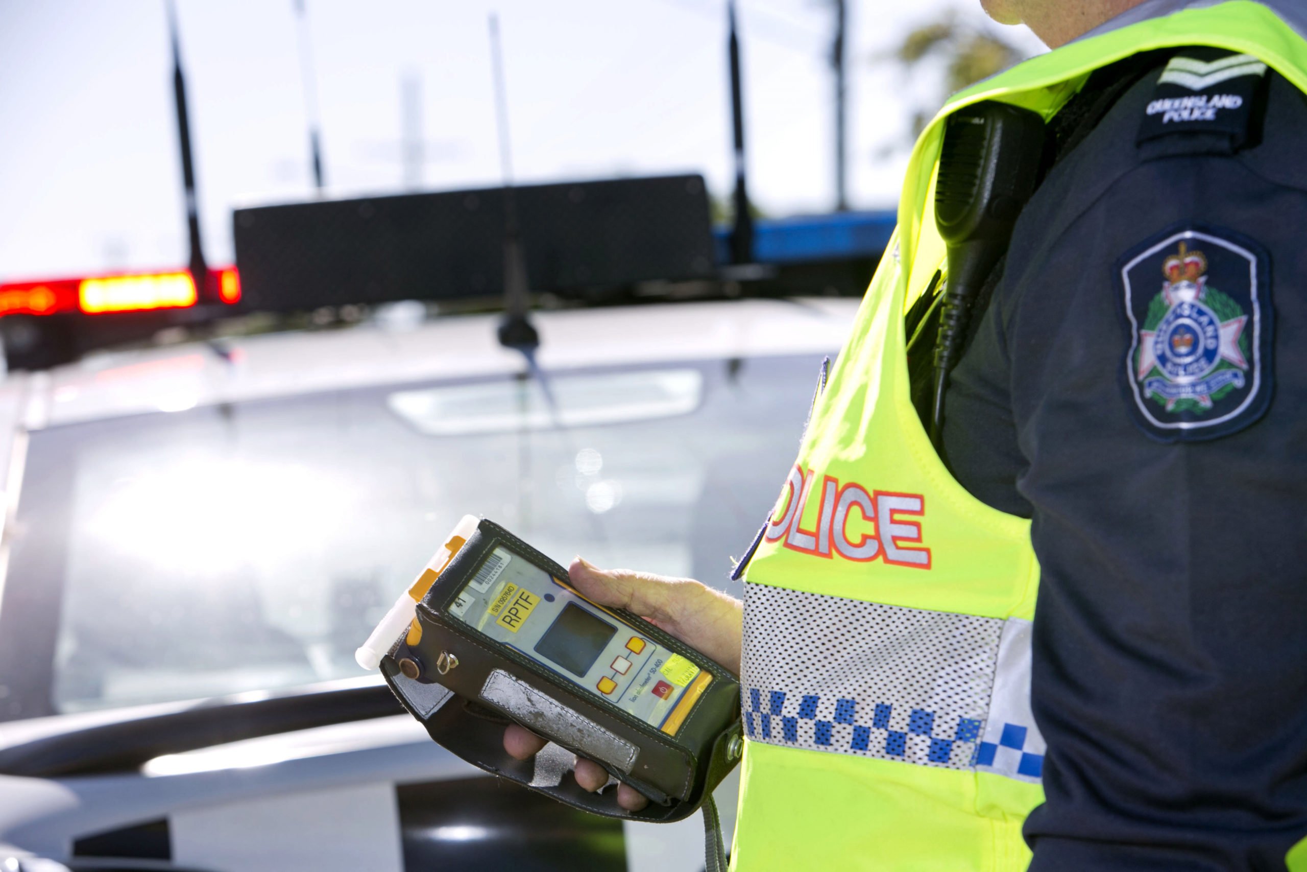
What will happen if I refuse police interview, breath/blood test, or don’t consent to search?
It is important to know your rights and any potential penalty should you choose not to cooperate with the police.

How do I choose the right criminal lawyer?
Choosing the right criminal defence lawyer is an important decision that can ensure you get the best possible result for